Going the distance on Strava

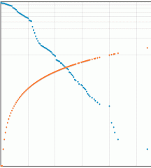
How many days have you gone a certain distance when running, cycling, etc? This page shows you your aggregate distance counts, which means that we include longer-distance counts in each shorter-distance count. For example, a 3-mile day will also also count as a 2-mile and a 1-mile day.
What this means is that we can compare our totals with the Eddington Number target; please have a read of Calculate your Eddington Number to find out more about that!
Your Eddington Number is the point on the chart where the two lines cross. For more detail, head over to My Strava Eddington Number.
To get started:


11 Comments

by Tyler on 24 July 2023
Thanks for the tool, John! Happy user for years now. Question: the y-axis origin is "0" but it seems like the longest activity point (i.e., the single furthest ride) sits on the "0" value rather than a "1" value?
Reply
by John Swindells on 24 July 2023
Hi Tyler, glad you like it, and hopefully it'll continue to motivate/interest you for many more years! I've checked the graph and can just about detect a difference between the dots with a count of 0 and those with a count of 1. You'll just have to imagine that your furthest ride sits "just above" the 0 line 😉
Reply
by Joe on 15 March 2020
Tried looking at the chart but the ads were blocking it. That had not happened previously, not sure how to view the chart now.
Reply
by John Swindells on 02 April 2020
Sorry I didn't see your comment earlier, Joe. Ads certainly shouldn't block any content on the page, so that's not good. If it happens again, please take a screenshot if you can and email it over (to webmaster@swinny.net). Thanks!
Reply
Show more
by Brian Ward on 24 February 2019
Seems like the Y-axis label should start at 1, not 0?
Reply
by John Swindells on 26 February 2019
Sorry Brian, I don't follow. The starting point for the chart is supposed to be (0,0) isn't it?
Reply
Show more
by Joaquim on 12 July 2017
Hi

why the y scale is not in log as is in imperial?

Nice work.

Reply
by John Swindells on 13 July 2017
Thanks Joaquim. Whether you get a log or linear scale depends on the range of values and where the two lines cross each other.
Reply
by Reuben on 05 June 2017
Any chance you could make each dot able to be clicked on or hovered over to get highlighted and show the exact count and distance it corresponds to?
Reply
by John Swindells on 08 June 2017
I finally managed to locate the problem! You've got your numbers now Reuben :)
Reply
Show more
Show more
by Daniel on 07 November 2016
I really like these kind of statistics. Very nice! But, can you explain my score of 63 on imperial distance and 91 on metric? 63 miles is about 85 km. So, on 63 days I cycled at least 85 km. But metric graph tells me on 91 days I cycled at least 91 km. In what way is it possible to score a larger distance on more days??
Reply
by Daniel on 07 November 2016
I realize now have made a mistake in calculating from miles to kilometers. I multiplied by 1.36 (the number used from kW to BHP) instead of 1.609 (from miles to kilometers).

So, the scores are correct actually. Sorry for any confusion :)

Reply
Show more
by Phoebe on 17 May 2016
This is a really neat graph that I've enjoyed looking at. Thanks!
Reply
by John Swindells on 17 May 2016
Glad you like it! I've been pondering about adding historical lines to the plot, showing where you got to at the end of each year for example.
Reply
by stone on 01 March 2016
might want to reliable the vertical axis to be more intuitive like "Count of Days at Distance"
Reply
by John Swindells on 01 March 2016
I like it, thanks for the suggestion!
Reply
by Lucas on 04 February 2016
This graph is really neat.

My graph is dominated by my commute. I wish I could set the axis so I could better see the more interesting tail.

Reply
by John Swindells on 05 February 2016
Ok, I've change it to a logarithmic plot. Looks much clearer for me. How does it look for you?
Reply
Show more
Show more
by MTB Tim on 11 January 2016
Oh MAN do I love a good graph! This is awesome...

(And thanks for opening Pandora's Box, by the way.)

Reply
by John on 11 January 2016
This is a really helpful representation for me and gives a real visual sense of how you need to do more of just the longer rides to improve the Eddington score, and how rides a lot longer than the current cross over point will be helpful for far longer. This representation helps explain what is otherwise a fairly cryptic number. Thank you.
Reply
by John Swindells on 11 January 2016
I'm glad that this visual reference has helped you, John!
Reply
Add your comment

Here are some more of your Strava stats