
Make Your Headlines Shine
By John Swindells
06 Oct 2011
| Comment
| Share:
 Facebook
 Twitter
 Copy link
https://swinny.net/Computing/Web_Programming/-4172-Make-Your-Headlines-Shine
Copy link
https://swinny.net/Computing/Web_Programming/-4172-Make-Your-Headlines-Shine
Facebook
Twitter
Copy link
https://swinny.net/Computing/Web_Programming/-4172-Make-Your-Headlines-Shine
Here we learn how to create a text shadow affect, using only a bit of CSS.
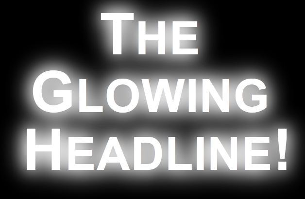
The Glowing Headline!
Here is the code to create this effect:
<style>
div.box{
background-color:#000000;
}
h4.glow {
padding:0.5em;
font-size:3.5em;
line-height:1em;
text-align:center;
color:#ffffff;
text-shadow: 0 0 0.4em #ffffff, 0 0 0.5em #ffffff, 0 0 0.25em #ffffff;
filter: progid:DXImageTransform.Microsoft.Glow(strength=5, Color=#ffffff);
}
h4.glow p{
zoom: 1;
background-color:#000000;
}
</style>
<div class="box">
<h4 class="glow">The Glowing Headline!</h4>
</div>
Each of the groups of parameters for the text-shadow property are: x-offset; y-offset; blur radius; colour. You need multiple sets of these parameters to create the staggered blurring, which creates the glow effect. The best thing is to take the code and have a play with the numbers. Note that text-shadow doesn't work with Internet Explorer, which is why there's a wrapper div element and a Microsoft.Glow attribute - to create a poor quality version of the text-shadow property's effect.
If you aren't seeing the glowing effect, please let me know!
Thanks to heygrady.com: CSS Text Shadows in Internet Explorer for the IE hack.
Share:
Facebook
Twitter
Copy link
https://swinny.net/Computing/Web_Programming/-4172-Make-Your-Headlines-Shine
Facebook
Twitter
Copy link
https://swinny.net/Computing/Web_Programming/-4172-Make-Your-Headlines-Shine
Comments
It's quiet in here...Add your commentRelated Reading
Web Development Survey!